![]()
19th November 2025
"Lato Typeface" - Finalise Design
Created using Adobe Illustrator using just fonts.
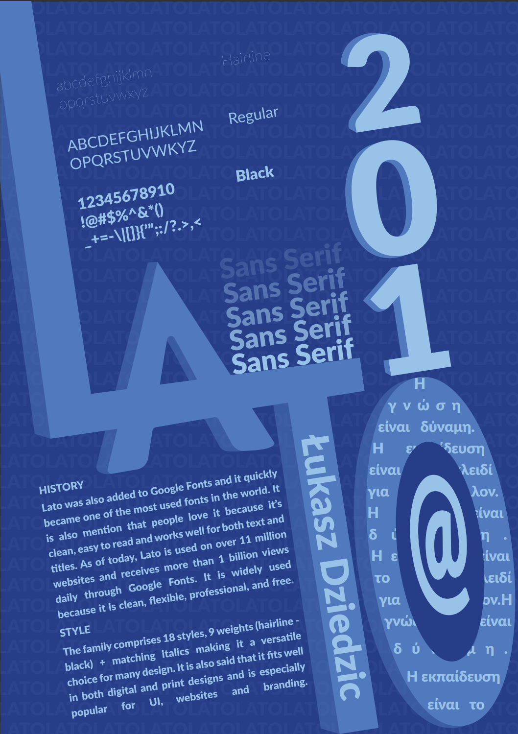
A finalised poster uses a monochromatic blue colour palette to create a calm, modern, and professional mood that reflects the personality of the Lato typeface. The layout is intentionally dynamic, with elements positioned in different directions to show movement while still keeping the design structured and readable. The large overlapping “LA” anchors the composition and visually represents the strength of the typeface, while the stacked “2010” adds height and draws attention to the year of its release. Repeated “Sans Serif” lines and varying font weights demonstrate Lato’s versatility and the vertical placement of the designer’s name adds contrast without disrupting the flow. The circular shape filled with Greek text and the @ symbol highlights Lato’s global usage and multilingual support, balancing the poster visually. Overall, the colours, positions and hierarchy work together to present Lato as a clean, flexible and contemporary typeface, communicated through a layout that is both playful and well-organised.
![]()
19th November 2025
"Lato Typeface" - Design 3
Created using Adobe Illustrator using just fonts.
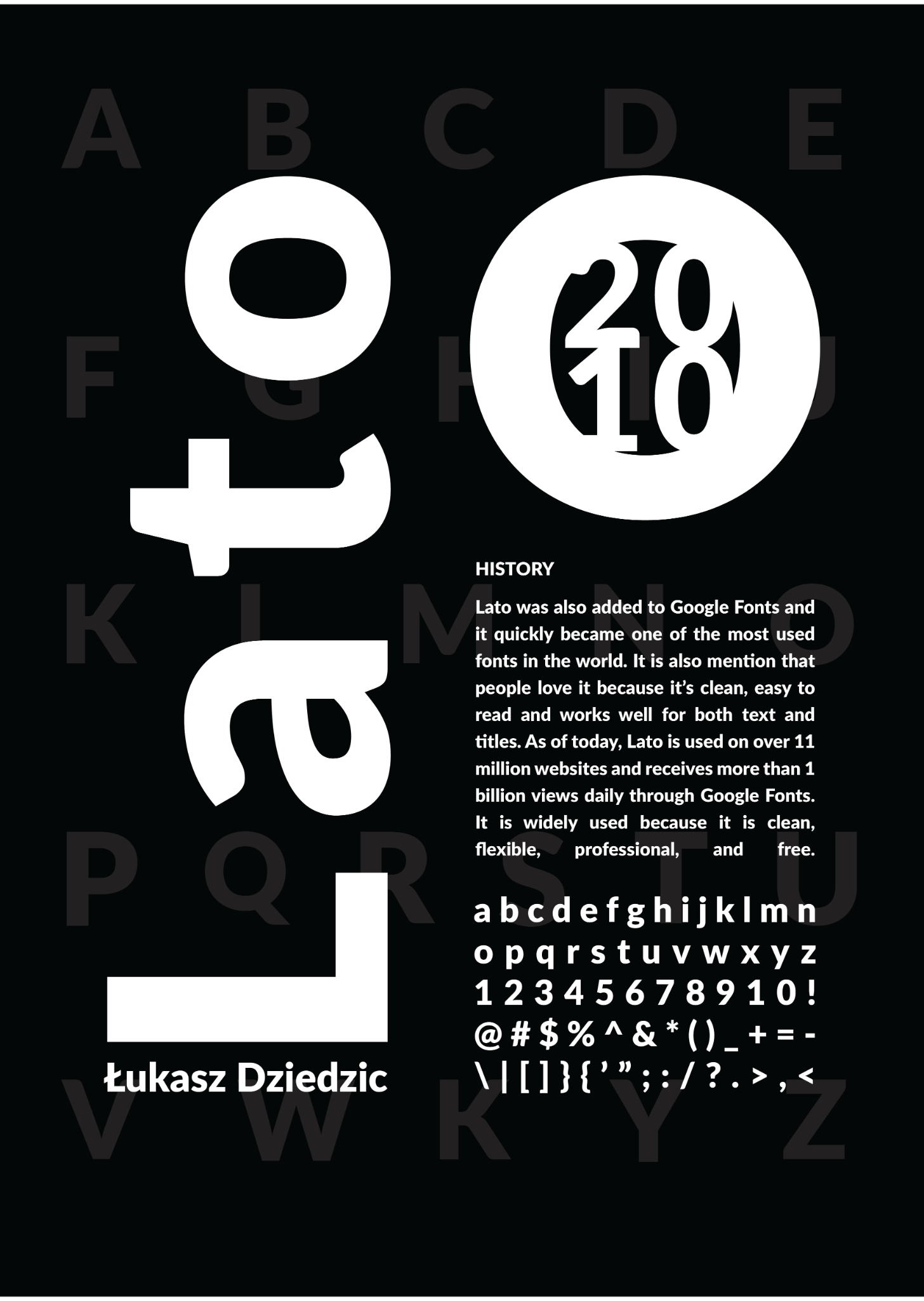
In the third design, I used a bold, high contrast black background to make the white typography stand out, then placed enlarged letterforms and the “2010” circle as graphic elements to add strong visual hierarchy. The alphabet in the background is kept faint to create texture without distracting from the main content. The layout is organized to balance large typographic elements on the left with readable informational text on the right. This approach is used to both showcase the typeface’s features and guide the viewer’s eye naturally through the history, creator and character set in a visually engaging way.
![]()
19th November 2025
"Lato Typeface" - Design 2
Created using Adobe Illustrator using just fonts.
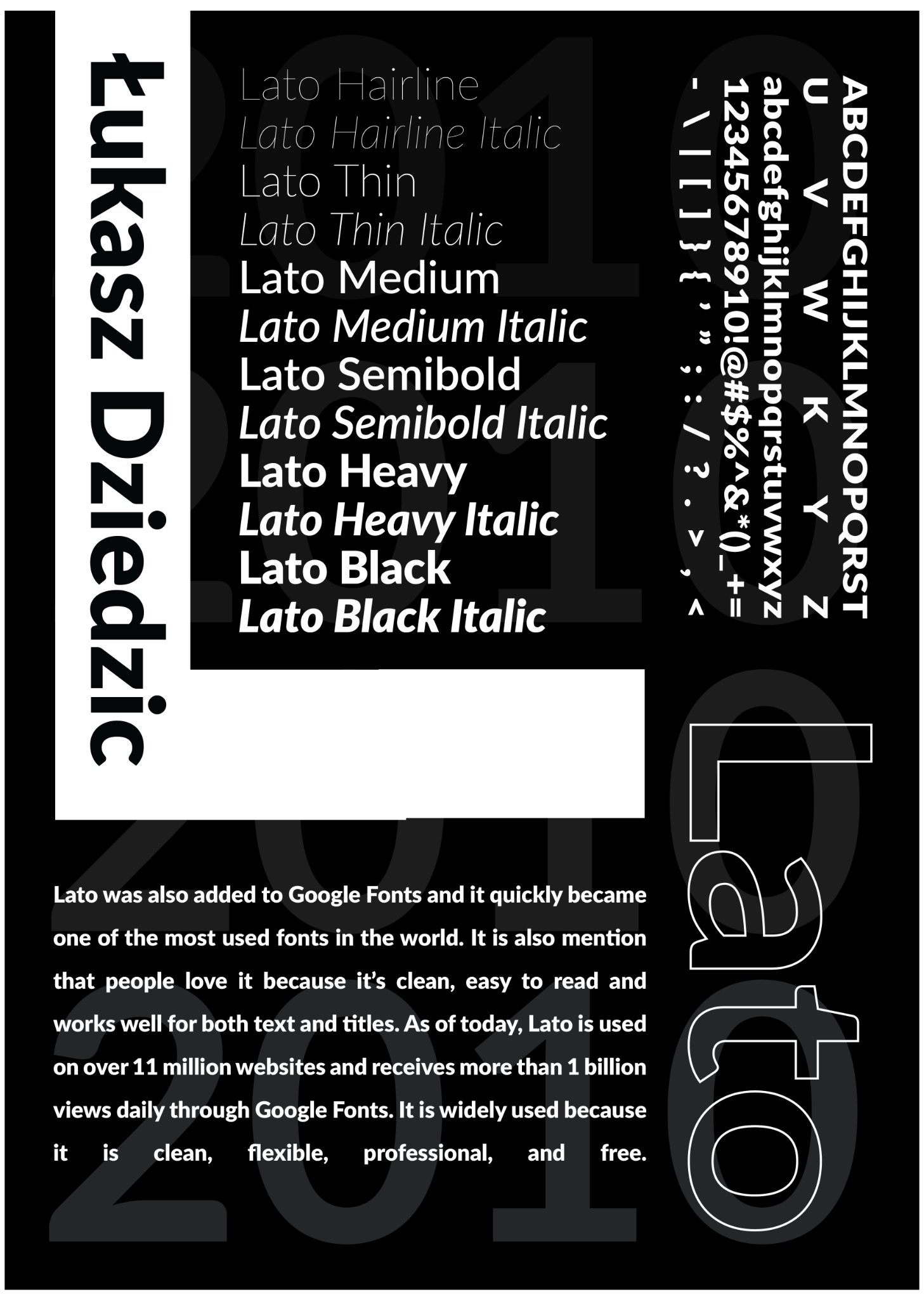
In the second design, I focused on showcasing the Lato font family and its different styles. I organized the font weights and italics in a clear hierarchy so viewers can see the range from Hairline to Black Italic. The designer’s name, Łukasz Dziedzic, is placed vertically to create visual interest and highlight the creator behind the font. I used a black and white color scheme to keep the design clean and professional, emphasizing readability and clarity. The text at the bottom explains Lato’s popularity and versatility, giving context about why it is widely used. I also included a large, transparent “2010” in the background and outlined letters on the right side to add depth and a modern, dynamic feel to the overall layout.
![]()
19th November 2025
"Lato" Typeface - Design 1
Created using Adobe Illustrator using just fonts.
Designer: Łukasz Dziedzic, self-taught Polish designer, born 1967.
Year: Designed in 2010, released publicly in December 2010 under the SIL Open Font License.
Purpose & Style: Humanist sans serif, highly readable, friendly yet professional. Combines semi-rounded strokes with a strong structure. Works well in body text, UI, websites, and branding.
Typeface Family: 18 styles (9 weights + matching italics), supports multiple languages including Cyrillic and Greek.
History & Facts: Originally created for a Polish bank, which didn’t use it. Released for free instead. Name “Lato” means “summer” in Polish. Expanded in 2013–2014 by Adam Twardoch and Botio Nikoltchev. Now widely used globally via Google Fonts, appearing on over 11 million websites.
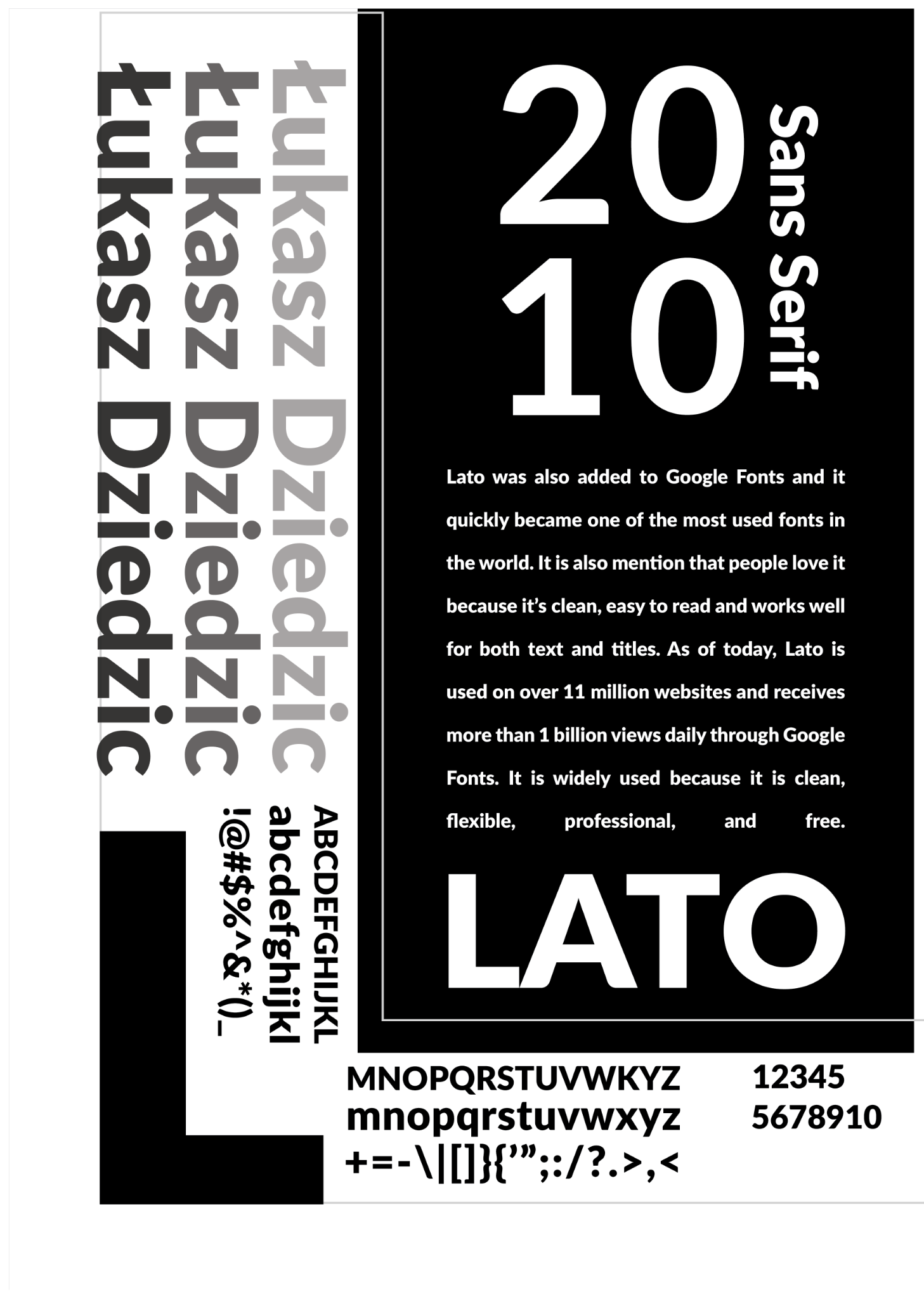
In this first draft design, I experimented with black and white, added ‘Łukasz Dziedzic’ to show who the designer is, and included the year the font was published. I also added an ‘L’ logo to emphasise that L stands for Lato.